External visual / editorial references
Business Future Today — reference set
Not a style-shopping list. Three different editorial systems that solve business/technology publishing well in different ways.

direct editorial benchmark
Bloomberg Businessweek
Business journalism with unusually strong art direction, graphics and cover thinking.
LearnMake business stories visually authored; let data, photography and illustration carry editorial opinion.
Do not copyDo not imitate its visual jokes, layouts or brand codes.
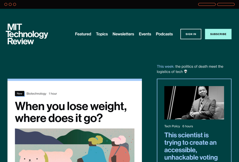
technology publication benchmark
MIT Technology Review
Strong modular digital system that can move between reporting, explainers, topics and subscription surfaces.
LearnUse modularity without making every module visually identical; strong topic architecture.
Do not copyDo not inherit its institutional/academic tone or teal identity.
taste / hierarchy reference
Monocle
A coherent editorial world where hierarchy, typography, photography and commerce feel intentionally related.
LearnBuild a recognizable editorial rhythm and strong section behavior.
Do not copyDo not turn BFT into lifestyle media or copy Monocle's classic newspaper mannerisms.
Publication Studio · Art Direction Review
Business Future Today — Art Direction
A business publication should feel like a real editorial product with a point of view, not a generic content template. These directions explore three distinct systems for business, AI and work coverage.
Selected direction
A
Signal Ledger
89 / 100 conceptual review
A modern business ledger: warm paper, hard editorial hierarchy, strong data labels and a yellow signal color. Serious without looking legacy-finance.
Typography
High-contrast editorial serif for headlines; disciplined grotesk for body; narrow mono/sans for metrics, timestamps and data labels.
Web language
• asymmetric newspaper-like homepage
• large lead story + compact signal rail
• thin rules, numbered sections and visible timestamps
• article pages with pull-data and operator takeaway blocks
Image / channel language
• documentary business photography with aggressive editorial crops
• charts and diagrams treated as first-class editorial visuals
• Instagram feels like a briefing desk, not a quote-card template
• newsletter resembles a morning executive note
Risk
Can become too newspaper-like unless photography, data and contemporary spacing keep it current.
B
Operator Terminal
82 / 100 conceptual review
A dark, high-signal operations console for founders and operators: modular intelligence, live-status energy and dense scanning.
Typography
Condensed sans display; neutral grotesk body; mono utility for metrics and source metadata.
Web language
• dark default surface
• modular card matrix with strong status hierarchy
• topic streams behave like operational feeds
• article pages foreground key decisions and implications
Image / channel language
• screens, infrastructure, people-at-work and systems imagery
• cobalt data accents
• social posts feel like concise operation briefings
• newsletter is a clean dark-mode operator memo
Risk
Strong tech/operator feel may narrow BFT too much and age quickly if every story looks like software.
C
Future Bureau
78 / 100 conceptual review
A crisp international bureau aesthetic: white space, cobalt structure, red editorial markers and visually confident feature packages.
Typography
Sharp contemporary serif for features; clean Swiss-style sans for navigation and news utility.
Web language
• wide editorial canvas
• section identities with distinct visual pacing
• feature stories use immersive image-led openings
• short news stays compact and highly scannable
Image / channel language
• global workplace and technology reportage
• strong use of full-bleed photo essays
• social uses dynamic crop systems rather than repeated slide layouts
• newsletter feels like a curated bureau dispatch
Risk
Most polished and flexible, but easiest to drift toward generic premium-media aesthetics.
Review decision
Preserve · Analytical tone, operator usefulness, business/technology focus and clear labeling.
Change · Current shared-template resemblance, generic serif/sans treatment and repetitive grid rhythm.
Why selected · Signal Ledger has the strongest distinctiveness while still supporting daily news, analysis, data and social derivatives. It also reconnects to the earlier warm-paper + signal-accent brand direction.
Next visual proof · Build real desktop/mobile home + article mockups using current BFT stories and existing photography; then score visual proof with the full art-direction rubric.